Peak amplitude inflated by noise
Symptom. Low-trial condition has larger peaks.
1 claim on this page is unverified. TODO(confirm) marks a specific statement the author has not yet checked against a
primary source. Everything else on this page has been reviewed. Treat a marked claim as
provisional and go to the cited source rather than quoting the sentence.
Symptom
The condition with fewer surviving trials has the larger peak amplitude. The effect is present with peak amplitude and absent with mean amplitude in the same window. Subjects with more rejected trials show larger components. A patient or child group — which moves more, and therefore loses more trials — shows “larger” components than controls. The apparent effect shrinks when trial counts are matched, and it grows when the rejection threshold is tightened.
Cause
Peak amplitude is the maximum (or minimum) of the waveform inside a window, and taking a maximum is not a linear operation. Adding symmetric, zero-mean noise to a waveform can push its largest sample further out but can never pull it back, so the expected peak of a noisy average is larger than the peak of the underlying signal:
E[ max(signal + noise) ] > max(signal)and the gap grows with the noise level and with the number of samples in the window.
Noise in an average falls as the square root of the trial count, so anything that changes the trial count — condition-biased rejection (pf-condition-biased-rejection), a rare-target design, a group that moves more, a subject with a bad electrode — changes the measured peak in a direction, not merely with more scatter. The result is a difference between conditions, groups or subjects that is a difference in data quality.
Two related consequences follow from the same non-linearity:
- Peak latency is affected too, and worse. The argmax of a noisy waveform jumps between local maxima, and because the window bounds it, at low signal-to-noise it drifts toward the window centre.
- Window width matters. A wider window can only find a larger maximum, so two studies with different windows are measuring different quantities — and a window widened after seeing the data is
pf-post-hoc-windowsas well.
Rectified or absolute-value area measures share the mechanism: noise adds area that cannot cancel. Signed area and mean amplitude do not, because they are linear.
Detect
- Report trial counts per subject and per condition, always, and look at them before looking at the effect.
- Measure the same effect with mean amplitude over the same window. If the effect is present with the peak and absent with the mean, the peak’s bias is the leading explanation.
- Plot the measurement against trial count across subjects. A downward-sloping relationship between trial count and measured peak amplitude is the signature.
- Thin the trials deliberately. Subsample the better-preserved condition to the trial count of the other, with a recorded seed, and recompute. A difference that vanishes under matching was a precision difference.
- Report the standardized measurement error per condition (L3.5). Unequal SME is the quantitative statement of unequal noise, and it is what a reader needs in order to judge a peak measure.
- Compare the noise estimates directly: the root-mean-square of the pre-stimulus interval of each condition’s average is a one-line check.
Fix
- Use mean amplitude over an a-priori window as the default measurement. It is linear, so its expected value does not depend on the noise level, and it commutes with averaging, difference waves and grand-averaging (L3.3).
- Use signed area when area units are wanted; avoid rectified area when noise differs across the compared units.
- For latency, use a fractional-area latency rather than a peak latency, or measure the peak on jackknifed grand averages with the corresponding correction to the test statistic (L3.3).
- Equalise the noise rather than the appearance: set rejection criteria condition-blind (L2.5), and where an imbalance survives, report the count-matched analysis alongside the full one.
- If the literature requires a peak measure, report it with the trial counts, the per-condition SME and a mean-amplitude analysis of the same window, so a reader can see whether the effect depends on the measure.
- Design against it. The trial-count argument of L3.5 is what stops the imbalance from being large enough to matter in the first place.
Example
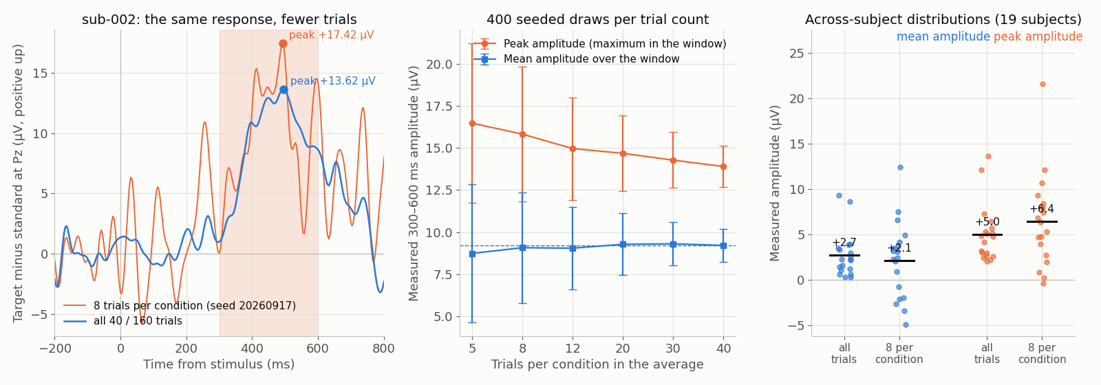
TODO(confirm): caption and numbers, once data/scripts/make_figures_p2.py has written /figures/pitfalls/pf-peak-amplitude-noise-bias.png and its sidecar — including the subject or subjects used, the measurement window, the trial counts on the horizontal axis, the seed of the thinning, and the measured peak and mean amplitudes at the two counts. The figure is generated from the same ds-erpcore P3 epochs that w-measurement-explorer and w-erp-averager serve (CC BY 4.0; derived: epoched, baselined, re-referenced, resampled). The description above states what the mechanism requires the figure to show; the sidecar’s own alt and caption are the authority once it exists.